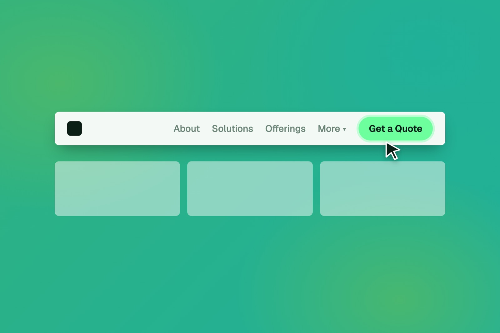
Your navigation menu is the first decision a visitor makes on your site. People scan websites, they don't read them. A menu that takes effort to figure out gives them a reason to drop off, and some of them go looking at your competitors.
Here are five signs yours is working against you.
1. Your menu has too many items
Every extra item is one more thing to scan and weigh. Five to seven is a common guideline. Group related pages together and cut anything that doesn't help someone take action.
2. Your labels use your words, not theirs
“Solutions” and “Offerings” mean something to you. A homeowner looking for a plumber wants to see “Plumbing Repairs” or “Emergency Service.” Name each page for what the visitor is trying to get done.
3. There's no button in the menu
A menu full of text links gives visitors plenty of places to browse and no push toward a decision. Add one clear button, like “Get a Quote” or “Book a Call,” and make it look different from everything around it.
4. Your main service is buried in a dropdown
If the service people pay you for sits under a “More” label, it's harder to find and takes visitors longer to reach. Visitors scan before they commit, so guide them there. Put your top one or two services in the main menu.
5. The mobile menu is a maze
A lot of your visitors are on a phone. Open your menu on one and try to reach your contact page and your main service. If you have to hunt, they will too. Check that the buttons are big enough to tap without zooming.
Fix the menu, not the whole site
Many of these fixes don't need a redesign. They need a clearer menu and a visible next step.